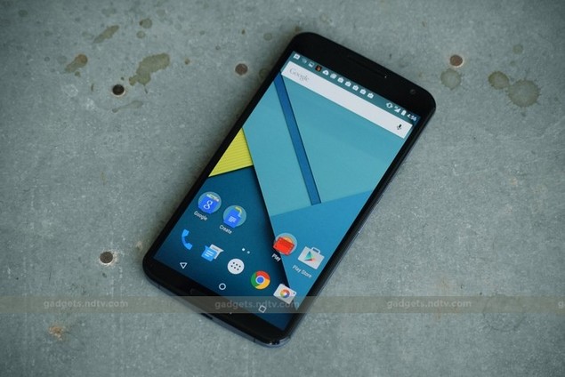
The Nexus series started out as Google's way of showing the world what its true vision of Android was - without the encumbrances of bloatware and UI customisations that had become the norm on handsets sold by partner manufacturers and wireless carriers around the world. Nexus phones have been well received by buyers, and though they don't offer absolutely top-of-the-line features, they're usually pretty great value for money.
The Motorola Google Nexus 6 is, as its name suggests, the sixth iteration in the series. However, over the past three generations, the number suffix has also come to represent each device's screen size. With a 6-inch screen, the new Nexus 6 is much less of a mainstream product than its predecessors were - outsized phones do have their fans, but this one feature will be the most significant reason for which people will either love or hate it.
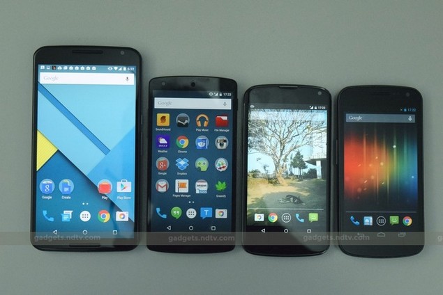
Look and Feel
There's no getting past the fact that the Nexus 6 is a big phone. A lot of people will be disappointed that Google decided to chase the phablet crowd and leave the mainstream market wanting. There is a lot of scope for a Nexus 6 "mini" - the company has painted itself into a corner with regard to its naming scheme, but we don't care about that. Something more along the lines of the Moto X (Gen 2) in terms of size would be fantastic.
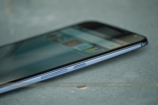
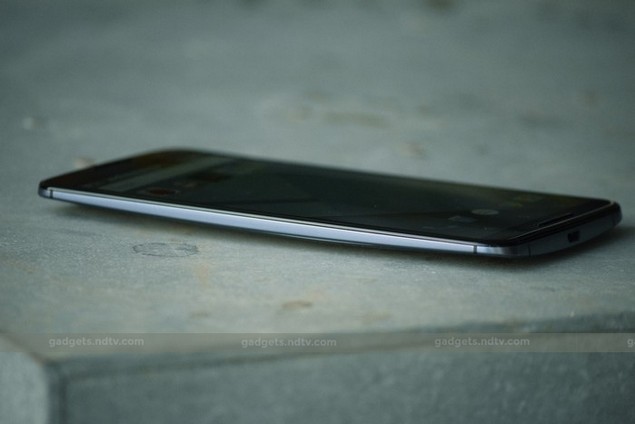
The front is all black glass, which appears to curl around the edges giving the device a borderless look. There is definitely a family resemblance to the current Motorola lineup, but this phone is by far the slickest and best looking. There's very little space around the screen. The twin speaker bars on the top and bottom are a subtle, smooth black and blend nicely into the front face rather than sticking out as they do on the other Motorolas. The only other thing you'll see is a cutout for the front camera, which is in the upper right corner. There's no branding and no other markings.
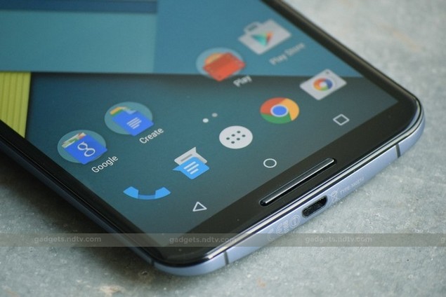
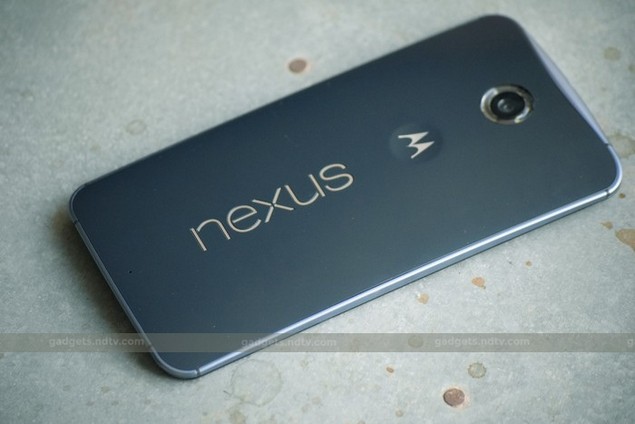
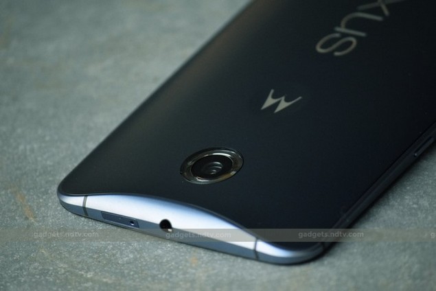
The rear and sides are two different shades of blue - while the metallic rim is light and pale, the matte back panel is dark navy blue. There are symmetrical breaks in each corner of the rim to allow antennas to communicate with the outside world, and Motorola's signature scoop on the top. An enormous Nexus logo runs vertically up the rear, with a Motorola emblem above it. The rear camera is surrounded by a plastic ring which covers the flash's twin LEDs.
In typical Nexus fashion, the phone is sealed and there is no microSD card slot. There's a tray for a Nano-SIM card on the top, next to the 3.5mm headset socket. The Micro-USB port is on the bottom, and the power and volume buttons are on the right - thankfully at around thumb height.
The Nexus 6 is surprisingly comfortable to hold thanks to its curved back and narrow screen borders. It's no lightweight at 184g, and you'll definitely feel its presence in a pocket.
Specifications
Google and Motorola have gone pretty high-end here - the specifications are on par with recent flagship phones from other manufacturers. There's a Qualcomm Snapdragon 805 SoC with four cores running at 2.7GHz and an Adreno 420 GPU, 3GB of RAM, and either 32GB or 64GB of storage space (but no way to expand this). The 6-inch screen (well, 5.96-inch to be exact) has a resolution of 1440x2560 pixels, resulting in a remarkable density of 493ppi.
Most modern connectivity standards are supported: Wi-Fi b/g/n/ac, Bluetooth 4.1, NFC, and A-GPS with GLONASS. The Micro-USB port supports SlimPort accessories for video output. The biggest disappointment is a lack of support for the 2300MHz Band 40 used by Indian LTE services - you'll have to wait for the service to roll out on other bands if you plan to use it at all.
The front face is made of Corning Gorilla Glass 3, which should help you avoid scratches and severe damage in case the phone is ever dropped. The rear camera has a 13-megapixel sensor, optical image stabilisation and a dual-LED flash. The Nexus 6 is capable of recording 4K video at 30fps. The front camera is a more modest 2-megapixel unit and can shoot video at 1080p.
Software
Android 5.0 is of course the big story here. Google has gone for a massive visual overhaul and there are hundreds of little things everywhere that surprised us. The fresh new look is a welcome change from what we've gotten all too used to in the years since Android 4.0 first came out, and it does suit the Nexus 6's huge screen very well.
Right from the initial setup screens, you'll know that things have changed drastically. The setup process is far more user-friendly than before, and you can set up security right away. Partly because of the new fonts and styles, and partly because of the Nexus 6's crisp screen, everything looks bright, fresh and engaging.
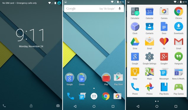
The homescreen is relatively clean. Google's ever-present search bar is right on top, and there's a prompt letting you know you can say "OK Google" to trigger voice command recognition. This worked fairly well for us, even in an office environment with lots of background chatter, when we weren't even deliberately projecting our voices.
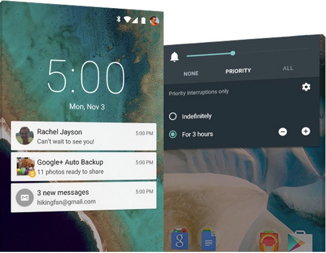
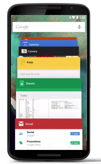
The new notifications shade and app switcher don't feel like separate things - they just sort of float on top of whatever you have on screen when you trigger them. Notifications appear as individual boxes against a slightly dimmed background, while the cascade of app thumbnails feels like it's spilling over the screen.
The main status bar has been simplified - icons are less detailed now, but you just have to touch the bar and it expands to show more information. A double-tap or swipe down reveals the notifications, but tap once again (or swipe down with two fingers) to show the new quick settings panel. This has also been given a stark visual makeover, and there are a few new touches as well, such as a control for screen casting and a flashlight toggle. Sadly, you can't see the battery level percentage without pulling down the quick settings panel, though this can easily be fixed via third-party addons.
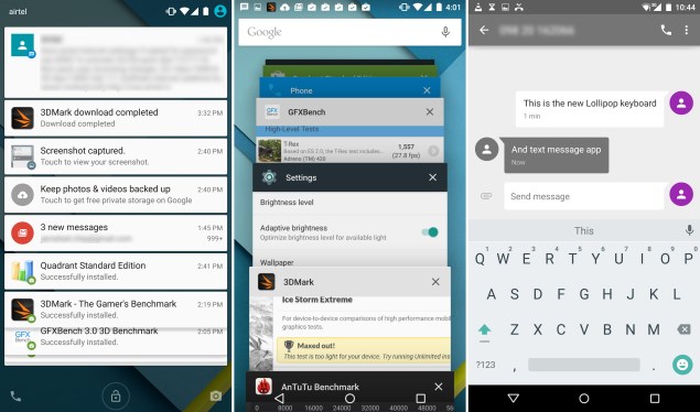
You can now have multiple user profiles, and the icon in the upper right corner lets you switch between them. There's also a guest mode which lets you lock down your personal photos and information when you hand the phone to someone else to use. Creating a new user profile takes you through the same routine used to set up the phone the first time you switch it on. Switching doesn't take much time and personal data is not shared between profiles.
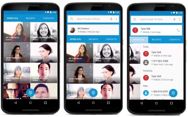
The new navigation button style takes a while to get used to, as does the bright white app drawer background. There are also loads of animations everywhere - every tap and swipe is accompanied by a little visual flourish. There's a transition effect for pretty much every possible action: apps launch by flying in from the bottom of the screen, the app drawer explodes out of its circular homescreen icon and collapses back into it when dismissed, and icons roll or expand into place. Tap on the Home button, an email preview in your inbox, a contact in the dialler app or even a notification popup, and you'll see a quick ripple letting you know the touch has been registered. Hit the end of a list while scrolling, and a colored arc swells out of the wall even as the list bounces back.
This is what Google calls Material Design. The company's extensive guidelines for Android 5.0 (and all its websites and apps going forward) state that it was created in order to deliver cohesive experiences across device types and interfaces, and that it blends "the classic principles of good design with the innovation and possibility of technology and science." While that sounds a little hyperbolic, there's no denying the scope of Google's ambition. Graphics must be crisp, colors must be bold, grids and spaces must be rigidly defined, and all actions must allow users to flow gently from one task or screen to another. Surfaces, motion and visual feedback are at the heart of Material Design.
Beyond mere visuals, there's a lot to dig into with Android 5.0. Project Volta is Google's term for an effort to squeeze every last drop of battery life out of an Android device by being a lot stricter about background tasks and data transmission. ART, the Android Runtime which has been around for a while but is the default on Android 5.0 Lollipop, is optimised for modern smartphone hardware and according to Google, can reduce memory and battery consumption while speeding up performance.
Overall, my favorite touches include the ability to search for settings in the Settings app, the fact that notifications that can be classified into different priority levels depending on the apps they originated from, and the new battery saver mode.
Performance
Other than the physical awkwardness inherent to such a large phone, the Nexus 6 was a pleasure to use. In the time we spent with it, there wasn't much to complain about at all. The interface is buttery smooth and all our test apps and games ran well - we just wish the animations and flourishes could be toned down. Most of our hiccups had to do with getting around the new version of Android - such as setting up notification priorities - but that's just because it takes a little while to get accustomed to the new system.
Benchmark scores is also pretty good in most cases, but surprisingly inconsistent overall. It broke through the 50,000 point barrier in AnTuTu 5 with a score of 50,609, beating both the iPhone 6 Plus and the Samsung Galaxy Note 4, although in stark contrast, the Quadrant score of 45,142 was puzzlingly low in comparison - the Galaxy Note 4 managed to pull in 86,992 points with nearly identical hardware specs.
Source: http://gadgets.ndtv.com/
NOTE: Feel Free To Comment....



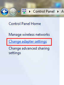
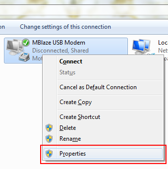
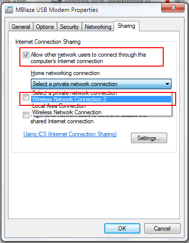
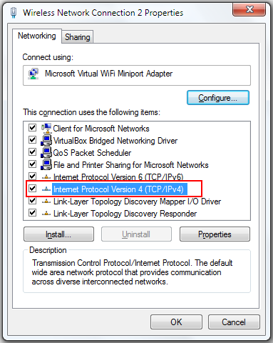
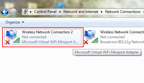 Now, open Properties of that “Wireless Network Connection 2″ (Microsoft Virtual WiFi Miniport Adapter). Double-click on “Internet Protocol Version 4 (TCP/IPv4)”.









0 comments: